I have an upcoming project where students will be tested on different topics within the same course and I wanted to be able to visually show the students how they did in each topic by using a column chart. After a bit of research, I came across the charts available on Google API (link). By using some JavaScript, I was able to dynamically create the charts inside of my Storyline course. With this method, you can chart multiple values, change how it looks, animate them, and even change the type of chart used.
Step 1: Prepare Your Storyline File
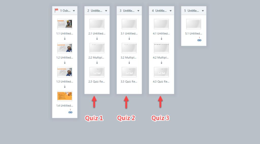
For my example, I’m using a file I’ve used before in other demos. I’ve added 3 different quizzes, 1 question slide and a result slides each, which will automatically create variables for each different quiz. I kept the default quiz names for each quiz to keep this simple.
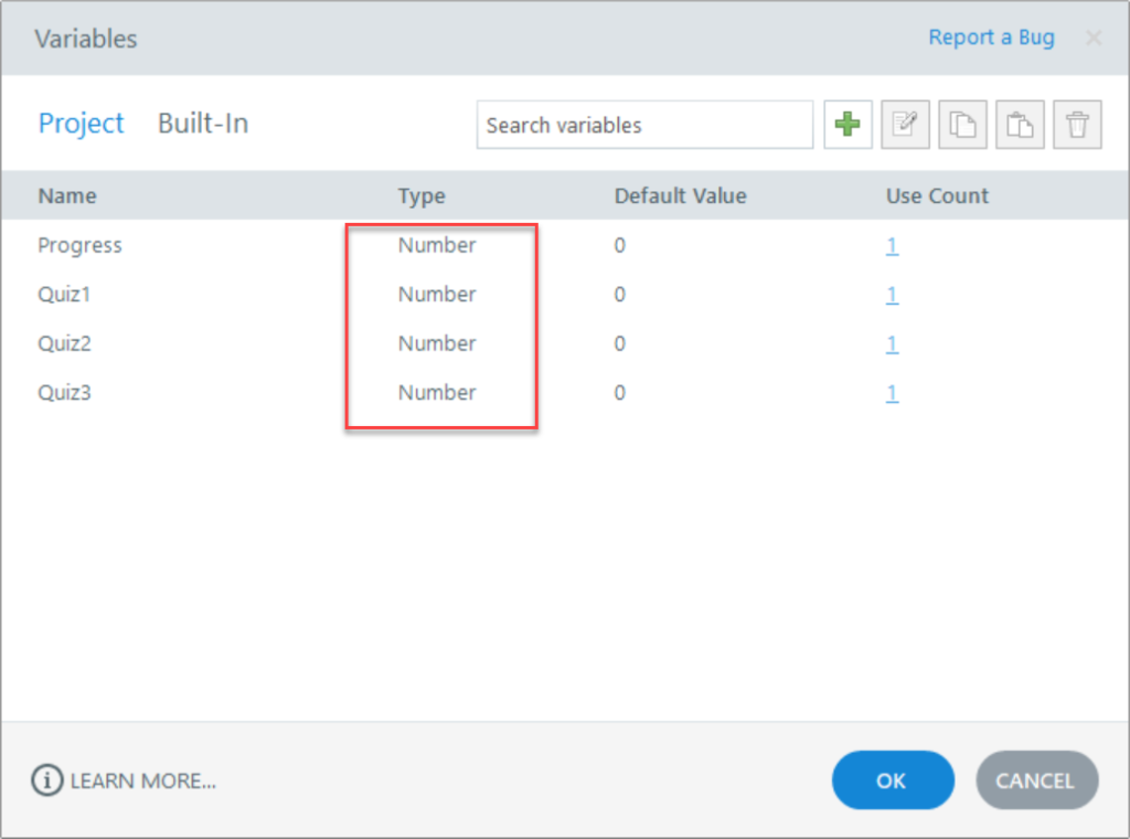
You will also need to create the same amount of numerical variables for each quiz or data point you need. Remember they need to be a number type. Give them a name that will be easy for you to remember and easy to type. I named mine; “Quiz1”, “Quiz2”, and “Quiz3”. Later on we need to adjust these variables to equal the default quiz variables.
Next, in the same folder as your storyline file (or anywhere really), create a new text document and rename it “index.html”. Make sure that it changes to a webpage file. You only need this because Storyline forces you to insert a webpage address when creating a web object.

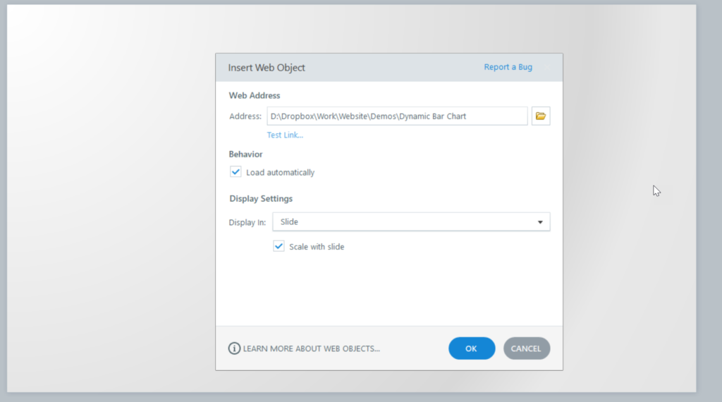
Which leads us to the next step. On the slide where you want to display the chart, insert a web object. In the address field, navigate to the index.html file you created. Keep the default options.
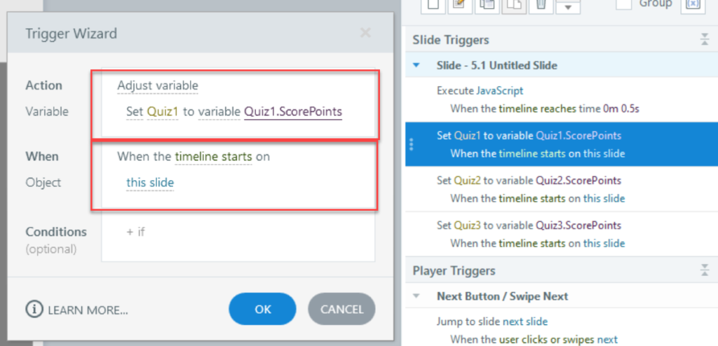
If you don’t plan on using quizzes for your data points, you can skip this part. On the same slide as the web object, we need to create a trigger for each variable we will be using as a data point. The trigger “Set your variable” to equal to “Quiz variable” when “timeline start”. Do this for each variable you created.
Sidenote: You might be asking yourself “Why are we creating new number variables and making them equal to the quiz variables if the quiz variables are already number type variables”. When I tried fetching the quiz variables through the JavaScript code, the code wouldn’t work. It’s probably due to the fact that the “built-in” variables like the quiz variables in Storyline are protected while “project” variables, like the ones you create, are not.
Step 2. Adding the JavaScript
On the same slide as the web object, create a trigger to execute following JavaScript code:
// Load the Google Charts library
var script = document.createElement(‘script’);
script.src = ‘https://www.gstatic.com/charts/loader.js’;
document.head.appendChild(script);
script.onload = function () {
google.charts.load(‘current’, {‘packages’:[‘corechart’]});
google.charts.setOnLoadCallback(drawChart);
function drawChart() {
// Retrieve Storyline variables
var player = GetPlayer();
var quizOne = player.GetVar(‘QuizOne’);
var quizTwo = player.GetVar(‘QuizTwo’);
var quizThree = player.GetVar(‘QuizThree’);
// Create the data table
var data = google.visualization.arrayToDataTable([
[‘Quiz’, ‘Score’, { role: ‘style’ }],
[‘Quiz One’, quizOne, ‘#b87333’],
[‘Quiz Two’, quizTwo, ‘silver’],
[‘Quiz Three’, quizThree, ‘gold’]
]);
// Set chart options
var options = {
title: ‘Quiz Scores’,
chartArea: {width: ‘50%’},
hAxis: {
title: ‘Score’,
minValue: 0,
maxValue: 100 // Adjust based on your scoring system
},
vAxis: {
title: ‘Quiz’,
minValue: 0,
maxValue: 100 ,// Adjust based on your scoring system
},
animation: {
startup: true,
duration: 1000,
easing: ‘out’
}
};
// Find the web object
var chartDiv = document.querySelector(‘iframe’).contentWindow.document.body;
// Create the chart
var chart = new google.visualization.ColumnChart(chartDiv);
chart.draw(data, options);
}
};
You will need to make the following changes to make sure it works with your variables. Starting on line 10, the code will retrieve the variables from storyline, so this needs to be adjusted to match the variables you created, not the name of the quiz variables. So I need to change the code to match “Quiz1, Quiz2, Quiz3”.
So I need to change this section:
  function drawChart() {
    // Retrieve Storyline variables
    var player = GetPlayer();
    var quizOne = player.GetVar('QuizOne');
    var quizTwo = player.GetVar('QuizTwo');
    var quizThree = player.GetVar('QuizThree');
To the following:
function drawChart() {
    // Retrieve Storyline variables
    var player = GetPlayer();
    var quizOne = player.GetVar('Quiz1’);
    var quizTwo = player.GetVar('Quiz2’);
    var quizThree = player.GetVar('Quiz3’);
Once you update it, click “OK”.
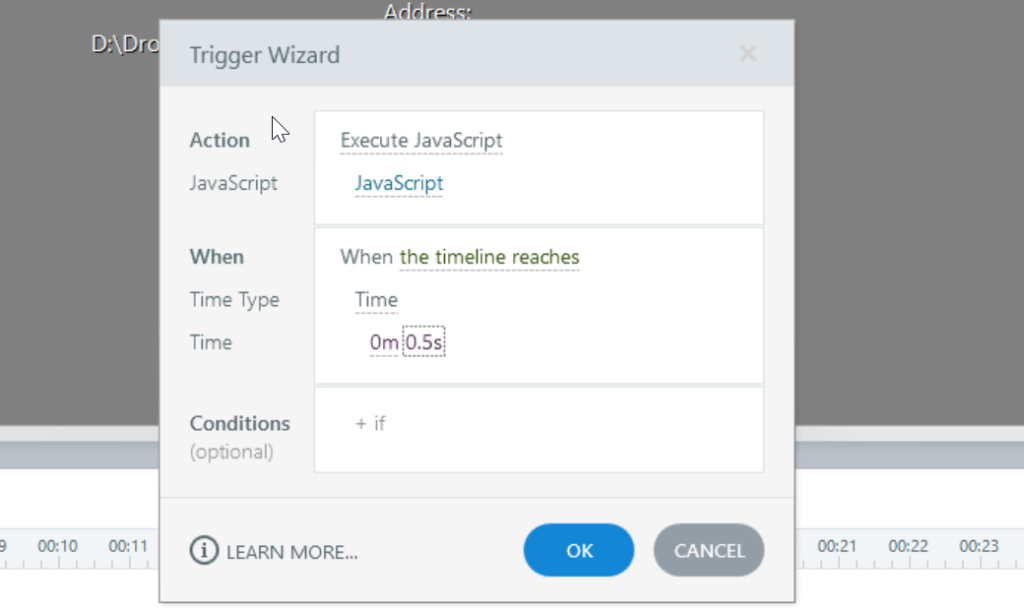
Now this is important. If you plan on executing the course when the timeline starts, you need to delay the time by .5 seconds. For some reason, when you try to execute the JavaScript when the timeline starts, the chart will briefly show and then be written over again. It may be due to a delay with Storyline redrawing the items on the slide. So change the “When” event to when the timeline reaches .5 seconds.
Step 3. Testing the Chart
This is the easiest part. Just publish to Articulate Review and test to see if the chart works. If it doesn’t, look at the bottom of this post for some troubleshooting techniques.
Step 4. Changing the Chart Options
You can change the chart title, minimum and maximum axis values and other values.
Starting online 25 in the following section you can adjust the settings or add more information. You can change the chart title, the horizontal axis title, and vertical axis title. One important change you might want to make is the Max Value option. Right now, it is set to “100”. You can change this to display whatever the max value is for your variables.
// Set chart options
var options = {
title: ‘Quiz Scores‘,
chartArea: {width: ‘50%’},
hAxis: {
title: ‘Score‘,
minValue: 0,
maxValue: 100 // Adjust based on your scoring system
},
vAxis: {
title: ‘Quiz‘,
minValue: 0,
maxValue: 100 ,// Adjust based on your scoring system
},
animation: {
startup: true,
duration: 1000,
easing: ‘out’
}
};
For more information on the options visit the Charts page on developers.google.com and click on any of the chart pages.
Step 5. Modifying the Chart
If you need to add more variables (columns), you’ll need to add it in the same section where we changed the variable names to the ones we created on line 10. For example:
function drawChart() {
    // Retrieve Storyline variables
    var player = GetPlayer();
    var quizOne = player.GetVar('Quiz1 ');
    var quizTwo = player.GetVar('Quiz2 ');
    var quizThree = player.GetVar('Quiz3 ');
    var quizFour = player.GetVar('Quiz4');
    var quizFive = player.GetVar('Quiz5’ ');
You will also need to add the variable name from the JavaScript code, and not the name of the Storyline variables to the section starting on line 17. In the previous section, the code is retrieving the variables in Storyline by the names of the variables given to them in storyline. It then gives it a new name. You have to use the new names in the second section.

You’ll need to add the new variables (columns) to this section starting on line 17:
    // Create the data table
    var data = google.visualization.arrayToDataTable([
      ['Quiz', 'Score', { role: 'style' }],
      ['Quiz One', quizOne, '#b87333'],
      ['Quiz Two', quizTwo, 'silver'],
      ['Quiz Three', quizThree, 'gold'],
      ['Quiz Four', quizFour, 'gold'],
      ['Quiz Five', quizFive, 'gold']
    ]);
You can change the colors of the colors of the columns in this section by using a Hex numbers or named colors like pink, silver, or red.

You can change the title of each bar by changing the name in the same section highlighted in bold.
    // Create the data table
    var data = google.visualization.arrayToDataTable([
      ['Quiz', 'Score', { role: 'style' }],
      ['Topic 1', quizOne, '#b87333'],
      ['Topic 2', quizTwo, 'silver'],
      ['Topic 3', quizThree, 'gold'],
      ['Topic 4', quizFour, 'gold'],
      ['Topic 5', quizFive, 'gold']
    ]);
Step 6 (Optional). Change the chart type
You can easily change the chart type by changing this line of code. Just change the name of the type of Chart to the new one. You can find the examples in the chart gallery and clicking on any example and look for the name of the chart type in any of the examples. Most of the chart types are just the name without spaces, for example “Area Chart” would be “AreaChart”. Some additional changes may be necessary depending on the type of chart you change it to.
// Create the chart
    var chart = new google.visualization.ColumnChart(chartDiv);
Errors: Data column(s) for axis #0 cannot be of type string
If you come across this error, it is probably due to the variable you are retrieving not being numerical variables. You need to make sure you have the correct type of variables. They need to be number variables, not just have numbers in them.
Errors: No data showing up.
If you come across this error, it is probably due to the variable you are retrieving not being numerical variables. You need to make sure you have the correct type of variables. They need to be number variables, not just have numbers in them.
Double check the variables you placed in the JavaScript code and they have the correct names. Double check that you have the correct formatting. Missing a single “,” in the code will prevent it from working. If you are not sure, throw the code in ChatGPT and ask it to verify the code. It should fix it for you and you can just copy and paste it.


